font-weight: 300 considered harmful (and a fontconfig workaround)
published (revision history)
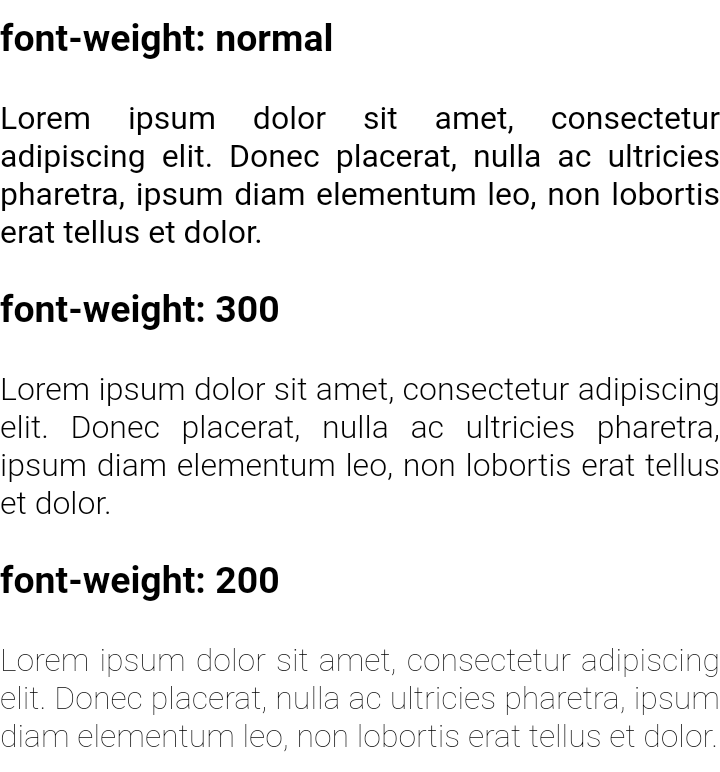
Many web pages these days set font-weight: 300 in their stylesheet. With
DejaVu Sans as my preferred font, this
results in very thin and light text that is hard to read, because for some
reason the “DejaVu Sans ExtraLight” variant (weight 200) is being used for
weights < 360 (in Chrome; in Firefox up to 399). Let’s investigate why this
happens and what can be done about it.
Table of Contents
The Problem
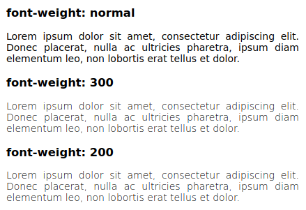
Here’s what a test page looks like on my laptop (14” 1920x1080):
For comparison, and possibly also as a clue as to why web designers use
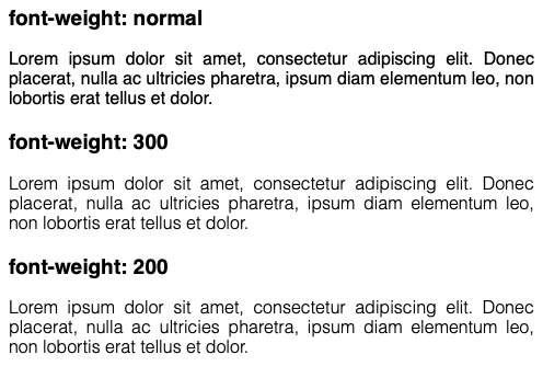
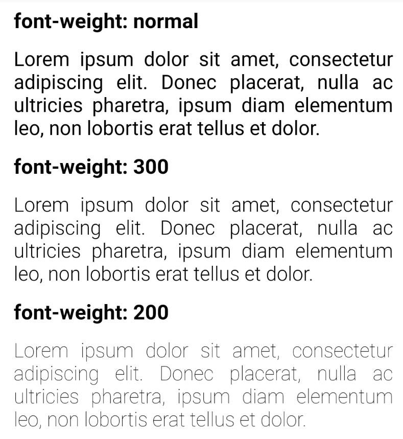
font-weight: 300, here’s a table of various font-weights of DejaVu Sans on
my system and the default sans-serif font on MacOS Catalina and Android
(unfortunately I don’t have any HiDPI laptop or low-DPI smartphone, so the
comparison might be imprecise/unfair):
| DejaVu | MacOS | Android | |
|---|---|---|---|
| 400 |  |
 |
 |
| 300 |  |
 |
 |
| 200 |  |
 |
 |
MacOS font smoothing, CSS
In MacOS, font-weight: normal looks almost bold, so web designers who use
MacOS/Safari might use font-weight: 300 to compensate for this, ruining it
for everybody else. :-(
Well, actually not everybody, as some desktop users (e.g. a Fedora Live DVD) won’t have an extra-light variant of sans serif, so the normal (regular, or book) variant will be used for all weights. But Android users and desktop users with DejaVu (used to be default on most Linux distributions, not sure what’s the current status) and possibly also Windows users are affected.
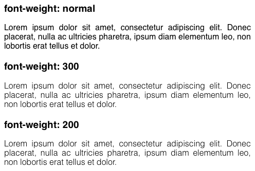
Nikita Prokopov suggested that disabling font smoothing in MacOS reduces the boldness, and my experiments confirm that. Furthermore, subpixel smoothing (antialiasing)2 comes somewhere in the middle between the default and no smoothing (on my display).
| default | subpixel | no smooth | DejaVu | |
|---|---|---|---|---|
| 400 | |
 |
|
|
| 300 | |
 |
|
|
| 200 | |
 |
|
| DejaVu | MacOS | Android | |
|---|---|---|---|
| 400 | |
|
|
| 300 | |
|
|
| 200 | |
|
|
Anyway, we can’t put all the blame on web designers. Matching an extra-light
font with font-weight: 300 doesn’t seem to be a good idea, and matching it
with font-weight: 350 is just plain silly (and I’d need to use explicit
language to describe my feelings about Firefox using an extra-light font for
font-weight: 399).
Actually, we can put all the blame on them, as font-weight: 300 has always
(even in CSS Level 1) meant
“lighter than normal, even if the only lighter font is weight 100.” Firefox’s
behaviour of selecting an extra-light font for font-weight: 399 is in fact
conforming to the most recent draft specification.
MacOS’ somewhat bolder rendering of normal-weight fonts is therefore a
very weak excuse for using font-weight: 300, which literally forces the
browser to not use a normal-weight font (or bolder) unless there is no other
font available.
With that out of the way, let’s finally proceed to fix work around the
problem, since persuading thousands of web developers to fix their websites
doesn’t seem feasible at this point.
Linux, fontconfig, CSS
Font selection and appearance in Linux is highly configurable via fontconfig. That is both a curse and a blessing. In this case, it is quite advantageous.
There are a few handy command-line utilities which make it really easy to test the configuration. I’ll use fc-list and fc-match here to see what fonts I have and when DejaVu Sans ExtraLight is used:
$ fc-list | grep -F -w 'DejaVu Sans' | sort
/usr/share/fonts/truetype/dejavu/DejaVuSans-BoldOblique.ttf: DejaVu Sans:style=Bold Oblique
/usr/share/fonts/truetype/dejavu/DejaVuSans-Bold.ttf: DejaVu Sans:style=Bold
/usr/share/fonts/truetype/dejavu/DejaVuSansCondensed-BoldOblique.ttf: DejaVu Sans,DejaVu Sans Condensed:style=Condensed Bold Oblique,Bold Oblique
/usr/share/fonts/truetype/dejavu/DejaVuSansCondensed-Bold.ttf: DejaVu Sans,DejaVu Sans Condensed:style=Condensed Bold,Bold
/usr/share/fonts/truetype/dejavu/DejaVuSansCondensed-Oblique.ttf: DejaVu Sans,DejaVu Sans Condensed:style=Condensed Oblique,Oblique
/usr/share/fonts/truetype/dejavu/DejaVuSansCondensed.ttf: DejaVu Sans,DejaVu Sans Condensed:style=Condensed,Book
/usr/share/fonts/truetype/dejavu/DejaVuSans-ExtraLight.ttf: DejaVu Sans,DejaVu Sans Light:style=ExtraLight
/usr/share/fonts/truetype/dejavu/DejaVuSansMono-BoldOblique.ttf: DejaVu Sans Mono:style=Bold Oblique
/usr/share/fonts/truetype/dejavu/DejaVuSansMono-Bold.ttf: DejaVu Sans Mono:style=Bold
/usr/share/fonts/truetype/dejavu/DejaVuSansMono-Oblique.ttf: DejaVu Sans Mono:style=Oblique
/usr/share/fonts/truetype/dejavu/DejaVuSansMono.ttf: DejaVu Sans Mono:style=Book
/usr/share/fonts/truetype/dejavu/DejaVuSans-Oblique.ttf: DejaVu Sans:style=Oblique
/usr/share/fonts/truetype/dejavu/DejaVuSans.ttf: DejaVu Sans:style=Book
/usr/share/fonts/truetype/ttf-dejavu/DejaVuSans-Bold.ttf: DejaVu Sans:style=Bold
/usr/share/fonts/truetype/ttf-dejavu/DejaVuSansMono-Bold.ttf: DejaVu Sans Mono:style=Bold
/usr/share/fonts/truetype/ttf-dejavu/DejaVuSansMono.ttf: DejaVu Sans Mono:style=Book
/usr/share/fonts/truetype/ttf-dejavu/DejaVuSans.ttf: DejaVu Sans:style=Book
$ fc-match -v sans \
  | grep -F -w -e style: -e weight: -e fullname:
        style: "Book"(s)
        fullname: "DejaVu Sans"(s)
        weight: 80(f)(s)

$ fc-match -v sans:weight=extralight \
  | grep -F -w -e style: -e weight: -e fullname:
        style: "ExtraLight"(s)
        fullname: "DejaVu Sans ExtraLight"(s)
        weight: 40(f)(s)

$ fc-match -v sans:weight=60 | grep -F -w -e weight:
        weight: 40(f)(s)

$ fc-match -v sans:weight=61 | grep -F -w -e weight:
        weight: 80(f)(s)

$ fc-match -v sans:weight=139 | grep -F -w -e weight:
        weight: 80(f)(s)

$ fc-match -v sans:weight=140 | grep -F -w -e weight:
        weight: 200(f)(s)
Fontconfig defines these symbolic font weights:
| constant | value |
|---|---|
| thin | 0 |
| extralight | 40 |
| ultralight | 40 |
| light | 50 |
| demilight | 55 |
| semilight | 55 |
| book | 75 |
| regular | 80 |
| normal | 80 |
| medium | 100 |
| demibold | 180 |
| semibold | 180 |
| bold | 200 |
| extrabold | 205 |
| black | 210 |
| heavy | 210 |
Apparently fontconfig selects the font with the closest weight requested. That’s not what CSS needs, so browsers probably don’t use fontconfig font patterns and therefore the usual fontconfig ways of avoiding the extra-light font don’t work.
But wait. Actually, some browsers do. The surf browser, built using
WebKitGTK, translates font-weigth: 300 to fontconfig weight 50,
font-weight: 200 to fontconfig weight 40 and font-weight: 100 to
fontconfig weight 0, which is a correct mapping, but it won’t result in
correct behaviour if only font weights 0 and 80 are available, as 80 is closer
to 60, but CSS mandates that 0 is chosen. (To find this out, I used
FC_DEBUG=1 surf.) Indeed, the fontconfig configuration suggested in the link
above is a sufficient workaround for the WebKitGTK browser:
$ FC_DEBUG=1 surf test.html |& grep -F -w -c ExtraLight
7
<?xml version="1.0"?>
<!DOCTYPE fontconfig SYSTEM "fonts.dtd">
<fontconfig>
	<match target="pattern">
		<test qual="any" name="family">
			<string>DejaVu Sans</string>
		</test>
		<test name="weight" compare="less">
			<const>book</const>
		</test>
		<edit name="weight" mode="assign" binding="same">
			<const>book</const>
		</edit>
	</match>
</fontconfig>
$ FC_DEBUG=1 surf test.html |& grep -F -w -c ExtraLight
0
In a real CSS-conforming browser, this won’t work as fontconfig is
presumably only used to list available fonts, and the font matching algorithm
then runs in the browser engine itself. One might also desperately attempt to
use fontconfig’s <match target="scan"> to lower
the weight of the font to 0 and hope the browser will select the nearer,
normal variant. Or at least I did desperately try that. That won’t work,
either:
-
CSS still prefers a weight 0 font for
font-weight: 300when both weight 0 and weight 400 are available. -
<match target="scan">needs to be applied system-wide and fontconfig caches then need to be regenerated using fc-cache by root, as apparently the system-wide caches are preferred. Therefore it’s also impossible to apply this rule to a web browser only.
There is still one option left, fortunately: <selectfont>, which controls the set of available fonts. Its documentation
is quite high-level and in some aspects downright incorrect, but by reading
the source
we can conclude that it works like this:
-
First, check if the filename is explicitly accepted by any
<glob>. If it isn’t, then check whether it’s rejected, and only if it’s not accepted but it is explicitly rejected, skip the font. Otherwise continue.(The documentation claims that
<glob>only filters directories, but this is fortunately not true.) -
Then, similarly, check if the font matches any accept
<pattern>(these may test various font properties). If not, check reject patterns, and skip the font if rejected and not accepted. Otherwise continue and allow the font to be used. -
Order of configuration directives doesn’t matter, it’s just being added to glob/pattern accept/reject lists as the configuration is read.
The Solution
Fontconfig’s <selectfont> lets us hide DejaVu
Sans ExtraLight from the browser. If we want to keep the font available for
other applications (if we don’t, then it might be easier to just uninstall
it), let’s create a browser-specific fontconfig conf:
<?xml version="1.0"?>
<!DOCTYPE fontconfig SYSTEM "fonts.dtd">
<fontconfig>
	<include>fonts.conf</include>

	<!-- disable DejaVu Sans ExtraLight, it tends to match font-weight: 300 -->
	<selectfont>
		<rejectfont>
			<glob>/*/DejaVuSans-ExtraLight.ttf</glob>
		</rejectfont>
	</selectfont>
</fontconfig>
When we now set the FONTCONFIG_FILE=~/.config/fontconfig/browser.conf
environment variable, DejaVu Sans ExtraLight is nowhere to be seen:
$ FONTCONFIG_FILE=~/.config/fontconfig/browser.conf \
  fc-match -v sans:weight=40 | grep -F -w -e weight:
        weight: 80(f)(s)

$ FONTCONFIG_FILE=~/.config/fontconfig/browser.conf \
  fc-list | grep -F -w -c ExtraLight
0
Setting FONTCONFIG_FILE=~/.config/fontconfig/browser.conf for the browser is
left as an exercise to the reader.
Appendix A: Why glob?
An observant reader might have noticed that the solution could be made more
robust by using <pattern> instead of <glob> and matching on the font weight, thus disabling all
light fonts. This is probably correct, but not usable in my case, as I already
use accept patterns to limit the available fonts to a few reasonable
ones to prevent web designers from selecting hard to read font
faces. With the advent of web fonts, this workaround has become less effective
lately. :-(
Appendix B: Reactions
-
Screenshots:
DejaVu Sans on my system
MacOS Catalina
MacOS Catalina + subpixel antialiasing
MacOS Catalina + disabled font smoothing
Android Samsung S10e
Android Samsung S3
↩ -
Subpixel antialiasing is disabled since Mojave, possibly because it’s not necessary with HiDPI/Retina displays and dropping it reduces code complexity considerably. ↩